Building a visual reference for B Lee Fencing
Handed over a poorly managed website with a view to providing visitors the appeal and visibility wanted by B Lee Fencing.
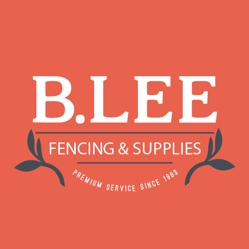
This is the customer facing brand, created as red and black on white. As the client expressed no wish to use print media in the short-mid term, this would only used for business cards (as this visual suggests) though the option is now available for print marketing should the need arise in the future.
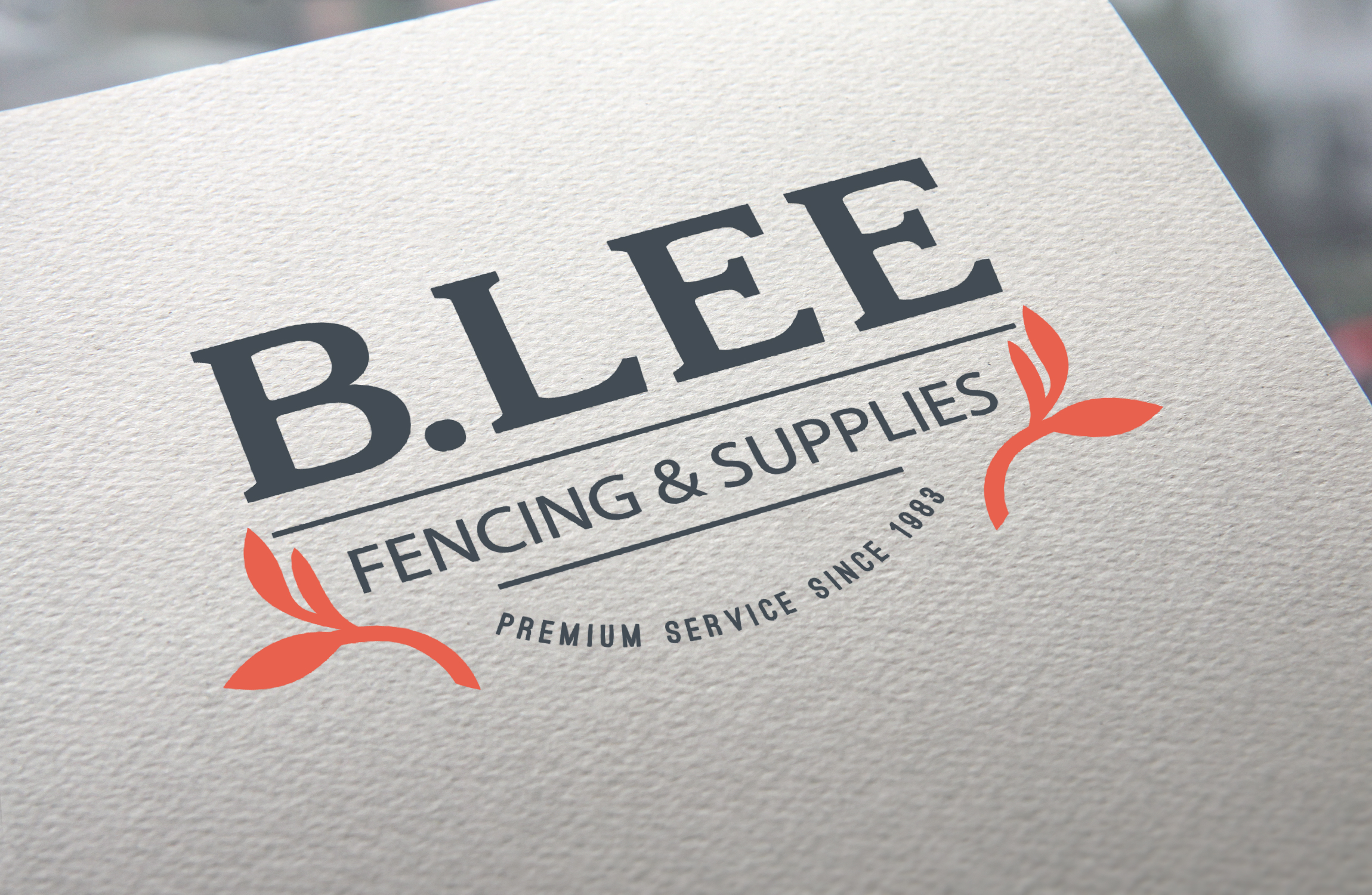
The branding for the business (vehichels, workshop and social media) is basically a reverse of the previous. The differene being that the red is striking and clearly stands out in the very saturated marketplace of Sheffield, giving B Lee addes appeal as professional.
The initial brief was to take-over the website and improve the visibility of B Lee Fencing to the local populas. With a business owner that didn't have a computer and still used a nokia, handing over was going to be a million miles away at best!
Without wanting to detract from the initial design of the website http://bleefencing.co.uk we found that pretty much all basic SEO and page calibration had been ommitted (meta, micro, analytics code, performance considerations and more). After a fair amount work the sites code and content was at a level accepable for submission to the big sites, as well as around 40 local listing sites.
The above branding was implemented throughout listings as well as a coherent write-up, links and services. Off the back of the listings came the creation of social network profiles for some of the relevant areas - facebook, google+, twitter and youtube. With the creation of social sites to help boost awareness, it was now necessary to create some sort of content to build momentum.

The global colour sceme for B Lee Fencing is currently one colour and two shades. We've earmarked a lime green for the fourth colour if required for further marketing.

On a recent visit to the workshop there was a new product sat in the corner. After a couple of moments considering previously used assets back at Showcase Imagery, I asked the lads to carry the (very) heavy picnic bench out into a clearing. A few shots (on the Nexus) later and the below blast was created...with a little help from Photoshop.

This is the most complete version of the marketing blast, which is for the primary network, Facebook. Naturally the bench was placed in the shot, painted up and shadows cast. Though the stock image itself had a few alterations too with HDR added to image a new sky layer added, a little exta lighting and obviously all the marketing.

Supporting image to highlight the dimentions of the Picnic Bench without detracting from the original scene.

The Twitter version of the scene was able to omit the footer copy as this was included in the tweet boby.

The Google+ version of the blast was able to benefit from a cut, bringing the subject front and center. I felt leaving the straw hat in shot added a reason for the bench to be there.
You may also like
Mayday - Fallen Souls
2013
ONLY ONE - Sean Seay {branding & marketing campaign}
2015
A3 folded Leaflet & Design, Sheffield Irish Association
2014
Paul's Fitness - A5 Flyer Design
2014
My Time - Cover Art
2013
Plumbstar - Start-up Package
2013
Branded marketing material
2013
long shots
2017
Safeguarding booklet
2016
Kalle Event flyer design
2013